Axis Scales and Decimals
How large the numbers on an axis look, how many decimals they carry and where the axis starts and ends are all set per axis, not per chart.
What it is
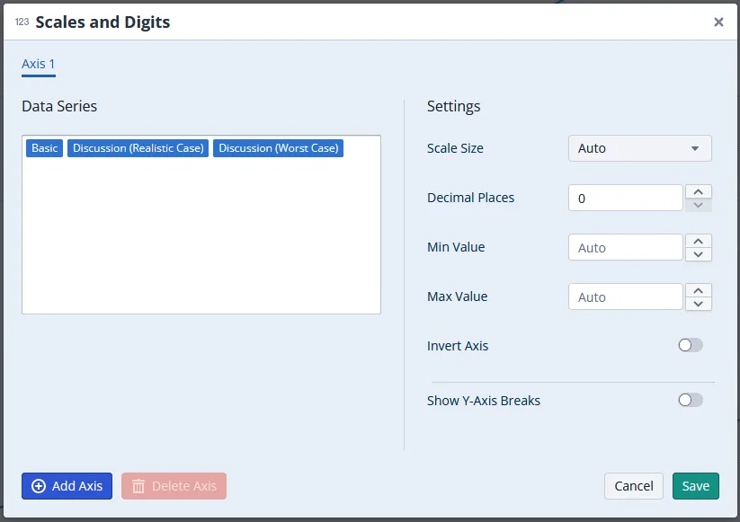
The default scale size and number of decimal places follow the unit and your system configuration, and can be overridden per chart. With a scale size of millions, 3,480,000 euros is shown as 3.5.
A chart can have several axes. That is what lets it display nodes with different units, for example one node in euros and one in percent, each against its own axis.
When to use it
- The numbers are too long to read and a scale of thousands or millions would do.
- The chart mixes units and the second unit needs its own axis.
- You want every chart on a sheet to start and end at the same value so they can be compared at a glance.
To give one node the same scale everywhere it is charted rather than fixing it per chart, see Default Scale Settings in Nodes.
Configuration
- Select the chart. The chart editor opens on the right.
- Scroll to the Formatting section and click Scales and Digits.
- Pick the axis tab you want to change, or add one with Add Axis.
- Set the values below, then click Save. Delete Axis removes an axis you have added.
| Setting | What you get |
|---|---|
| Scale Size | The factor the values are shown in, for example millions. Auto follows the unit and your system configuration. |
| Decimal Places | How many decimals the values carry, from 0 to 5. Leave it empty for Auto. Typing more than 5 is refused with a warning. |
| Min Value, Max Value | Where the axis starts and ends. Auto picks values that use the available space well. |
| Invert Axis | Turns the direction of the axis around. |
| Show Y-Axis Breaks | Draws the axis with a break in it instead of one continuous range. See Y-Axis Breaks in Charts. |
Good to know
- The scale applies to the whole axis. When a chart mixes nodes of very different magnitudes, one axis scale cannot suit all of them, and raising it rounds the small values to zero. Set the scale per node instead: see Default Scale Settings in Nodes.
- Rescaling is not the only way to fit a wide range. To keep small differences visible without touching the scale, break the axis: see Y-Axis Breaks in Charts.
- Show Y-Axis Breaks is off limits with several axes. On a chart with more than one axis the toggle is disabled: see Y-Axis Breaks in Charts.
- Each axis carries its own data series. Moving a node to a second axis changes which axis its values are read against, not the values themselves.
Related
- Default Scale Settings in Nodes: one scale for a node, everywhere it is charted.
- Y-Axis Breaks in Charts: cut a large value range instead of rescaling it.