Chart Types
A chart in Valsight is a tile on a worksheet. Every type is added and configured the same way, so the only real decision is which one shows your data best.
To add a chart, see Creating Charts. To configure one you already have, see Data Display in Charts and Tables.
Start here if you want to:
Diagrams
| Chart | Use it when | Example |
|---|---|---|
| Column Chart | You want to compare key figures of the same dimensionality, for example profit across scenarios and years. Data series stand next to each other as vertical bars. | 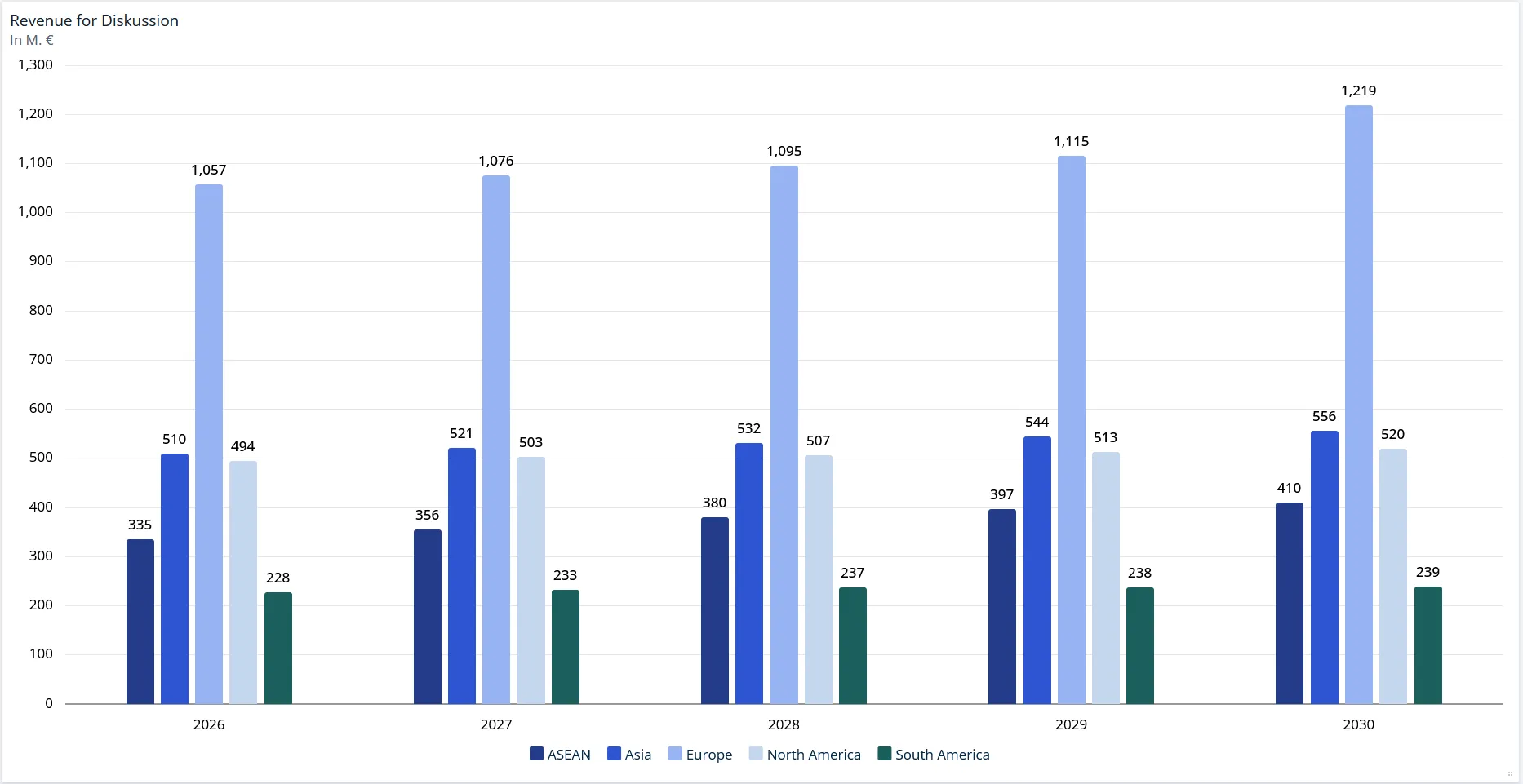 |
| Bar Chart | You want the same comparison, but horizontally. | 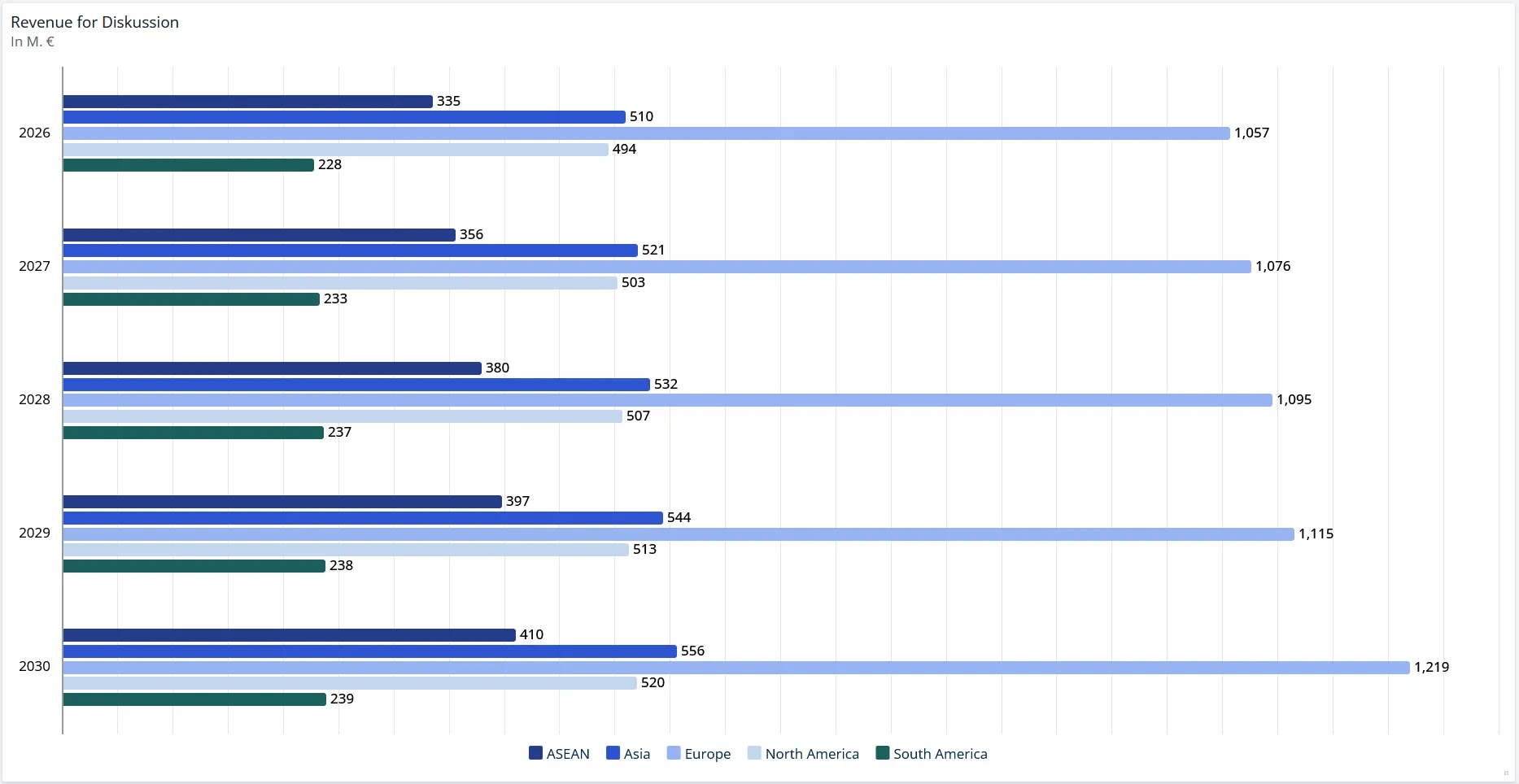 |
| Line Chart | You want to see the trend of one or more key figures. Values are connected as lines, which makes the direction of the development easy to read. | 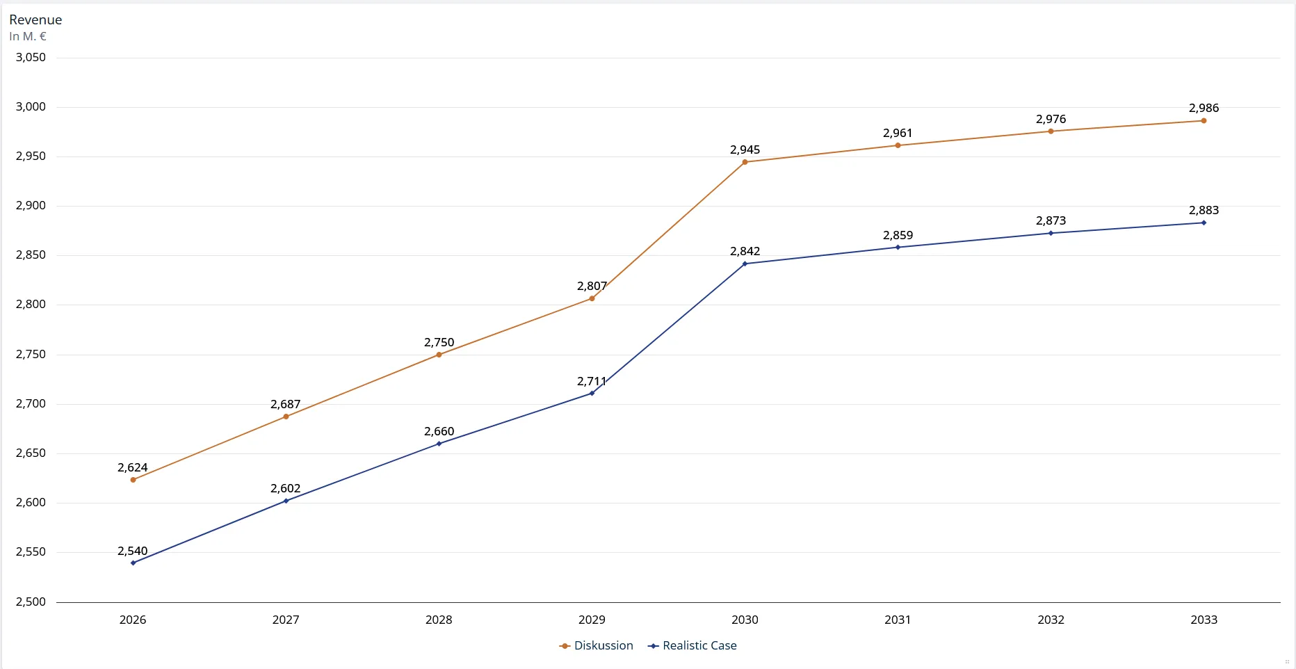 |
| Mixed Chart | One data series has to stand apart from the others, for example a benchmark line drawn across a stacked breakdown. Each data series can be shown as a bar, line, area or spline. | 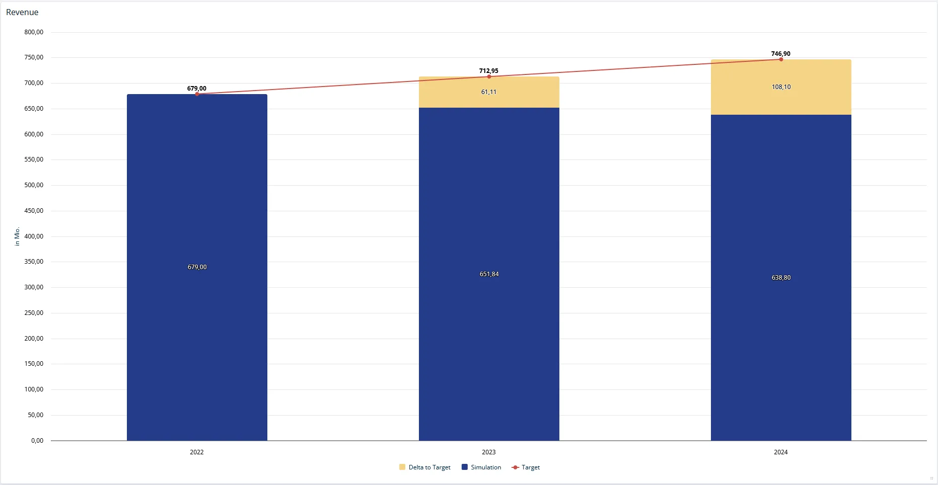 |
| Area Chart | You want a trend with the area under the line filled, so the volume behind the development is visible as well. | 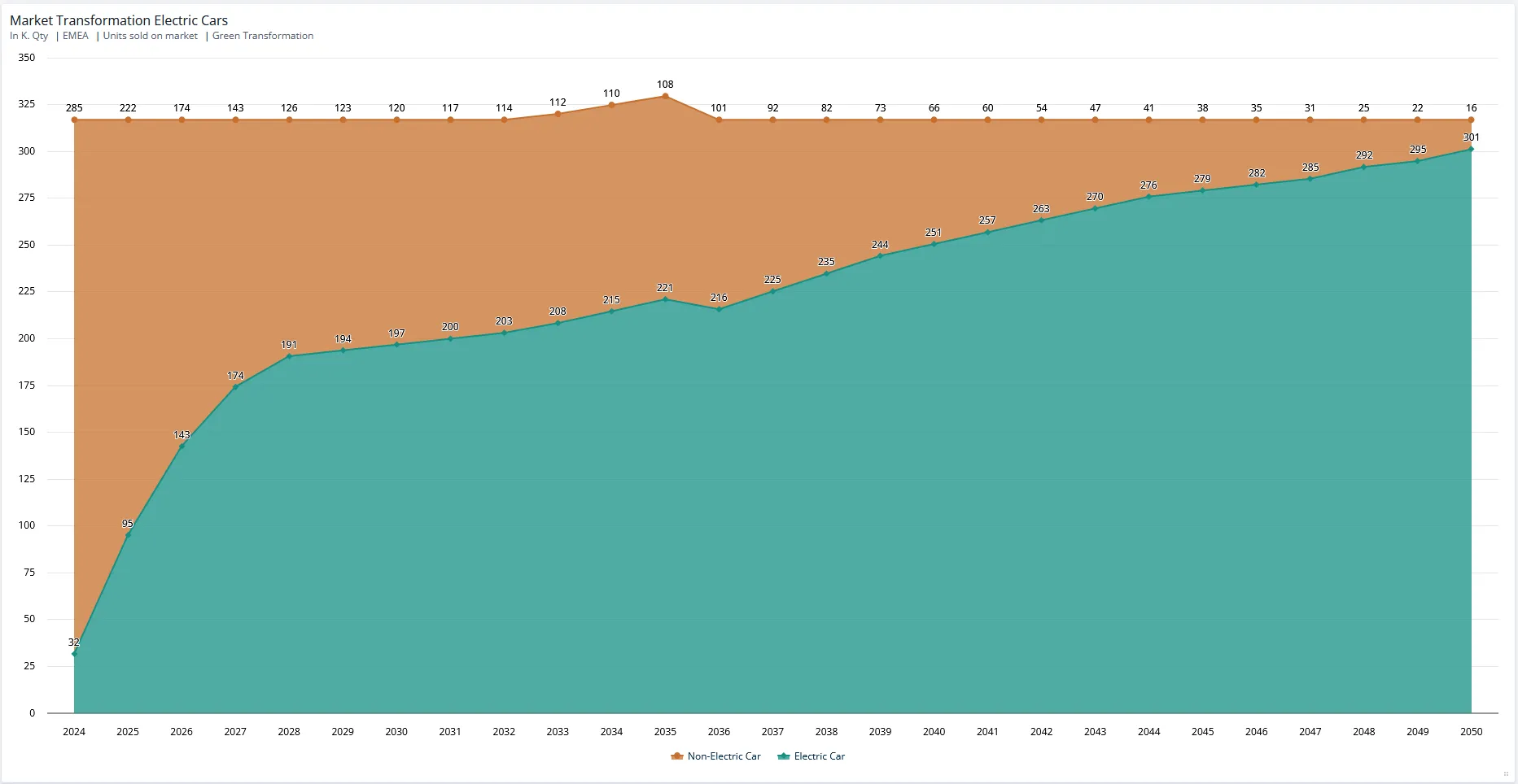 |
| Pie Chart | You want the shares of a single total at one point in time. Proportions are shown as segments of a circle. | 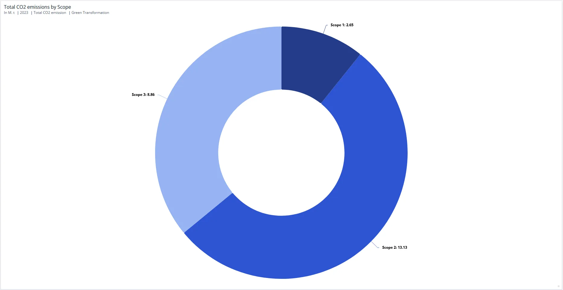 |
Stacking is a setting rather than a chart type: columns, bars, areas, lines and mixed charts can each be stacked. See Stacking and Stack Totals.
Tables
| Chart | Use it when | Example |
|---|---|---|
| Table (all dimensions) | You want the full detail in front of you: every dimension of the node, rather than an aggregate. This is the first entry under Tables. | 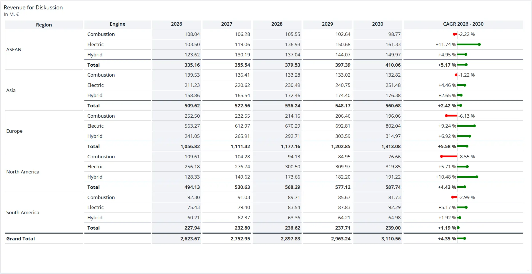 |
| Table | You want many figures at once, aggregated, with the dimensions you choose on rows and columns. Tables are how profit and loss statements, cash-flow statements and similar reports are built. | 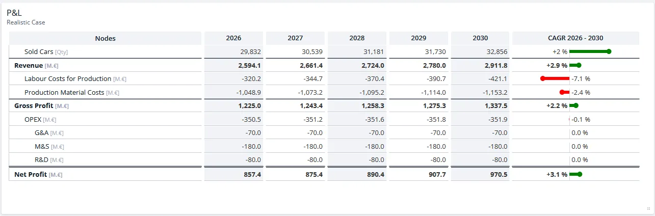 |
A table only displays results. For one that readers can type into, see Input Table under Simulations. For how to set the axes and choose the level of aggregation, see Data Display in Charts and Tables.
Bridges
A bridge breaks a difference down into the individual effects that produced it. Both kinds use the same staircase shape, which the chart editor calls a waterfall chart, and they differ only in which difference they explain.
| Chart | Use it when | Example |
|---|---|---|
| Scenario Bridge | The steps should explain a difference between two or more scenarios, broken down by assumption, line-item or dimension. | 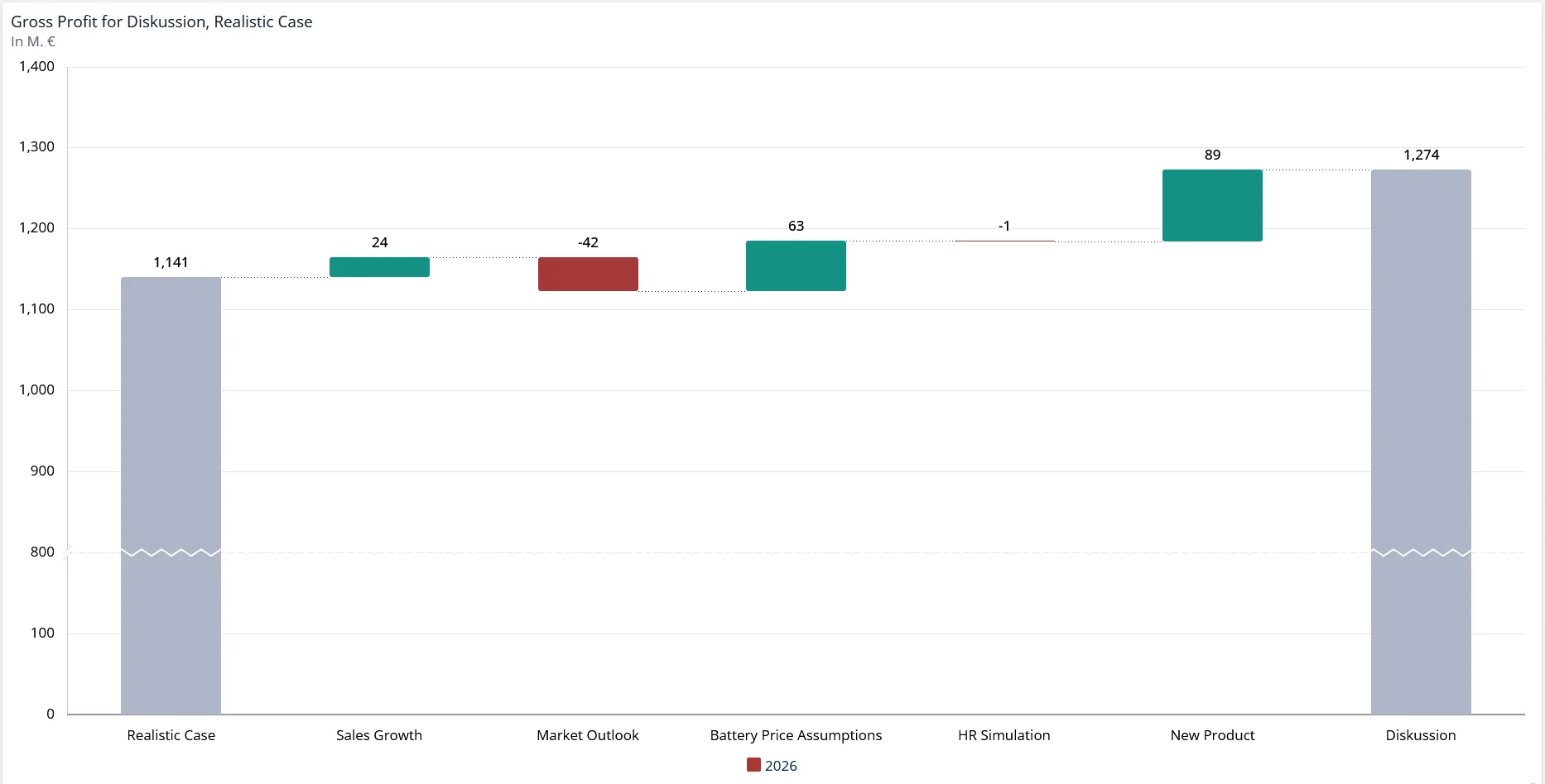 |
| Time Bridge | Those effects should explain the change between two or more points in time within one scenario. | 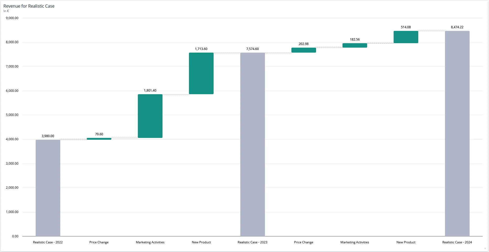 |
The steps do not have to be derived effects. Put nodes on the axis instead and you get a plain build-up, for example revenue and costs stepping down to gross profit.
Simulations
These tiles let people run simulations on the worksheet itself, rather than only read the results of one.
| Tile | Use it when | Example |
|---|---|---|
| Scenario Manager | You want the full Scenario Manager as a tile, so simulations can be run on the sheet itself. It is configured per sheet and looks the same for every user, unlike the stationary Scenario Manager. | 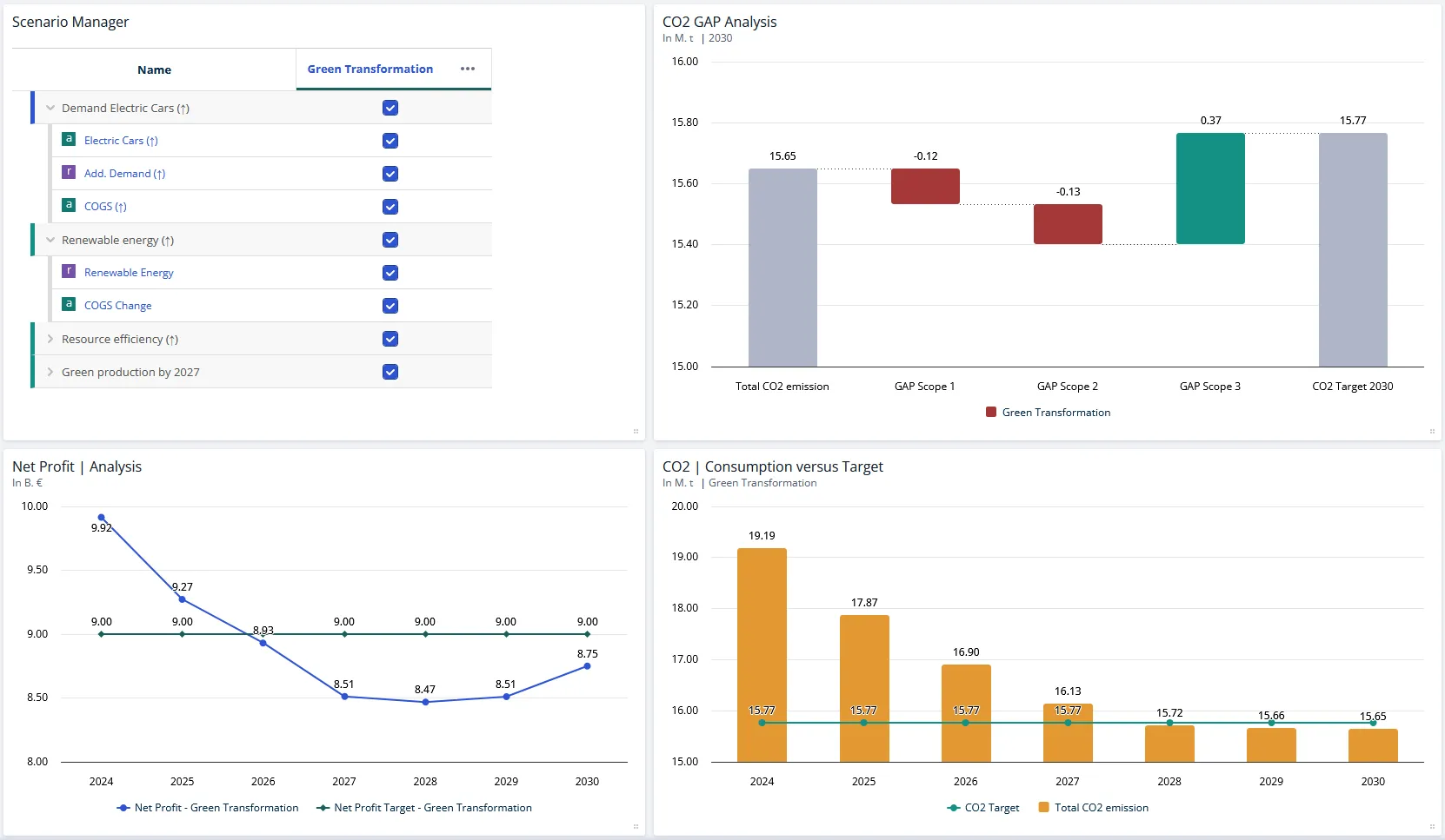 |
| Input Table | You want readers to enter values on the worksheet instead of only reading them. | 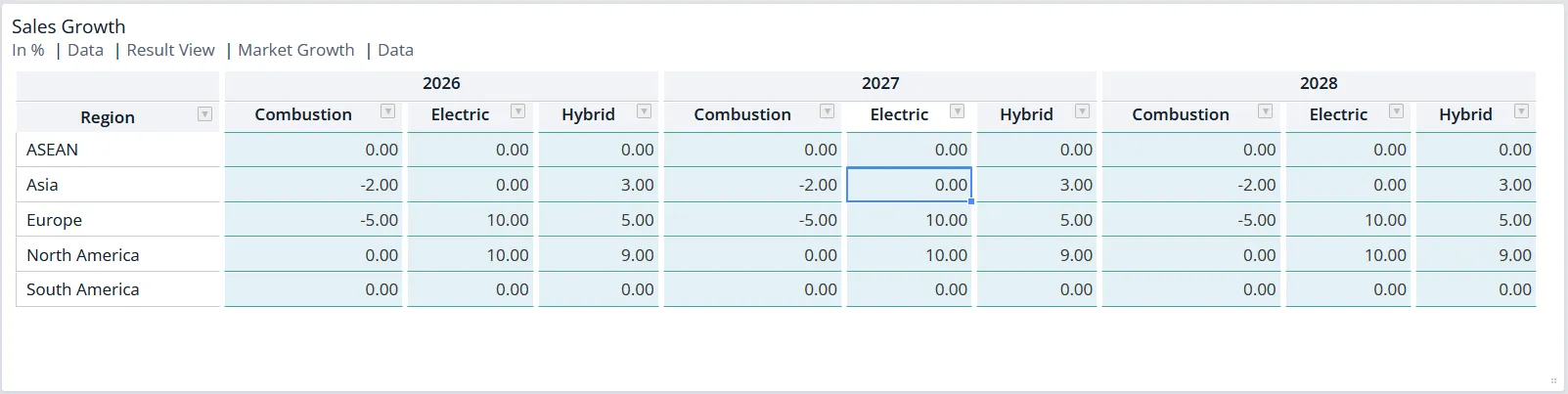 |
| Slider | You want selected line-items adjustable directly on the worksheet, without opening the Scenario Manager. | 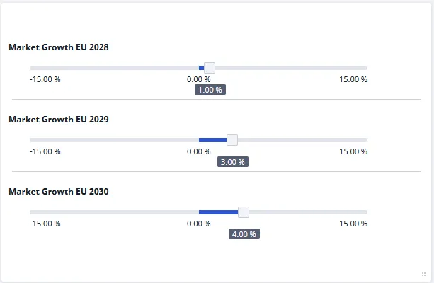 |
| Split Slider | You want to redistribute a total across its parts, for example a product mix or an allocation, while the total itself stays fixed. | 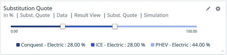 |
Others
| Tile | Use it when | Example |
|---|---|---|
| Tree | You want to show the value driver structure behind the numbers. The nodes of the underlying model are drawn as a graph, the model tree, and can display values for several scenarios. | 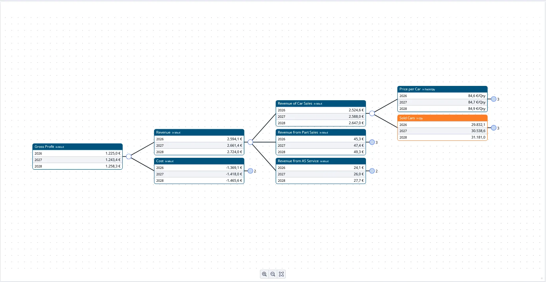 |
| Text and Image | You want to add something to the worksheet that is not data: a headline, a list of targets, a note for other users, a logo or a diagram. These are the two tiles that turn a sheet of charts into something you can present from. | 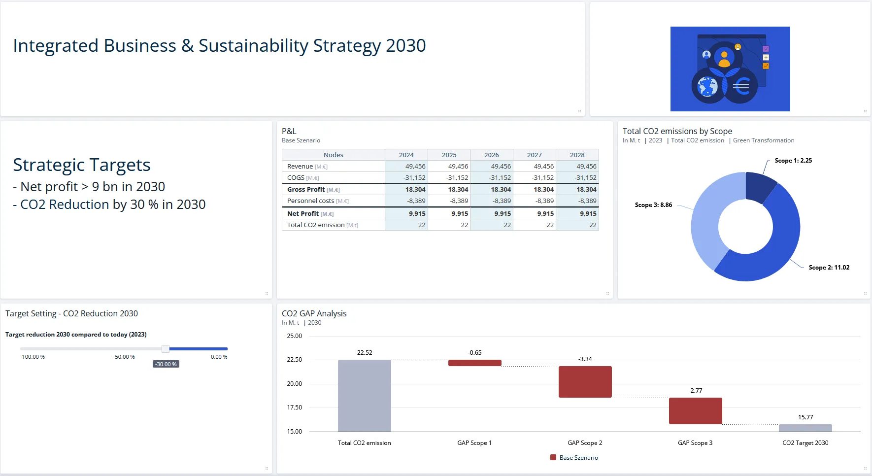 |
| Packed Bubble Chart | You want to compare the magnitude of many items at once, for example the effects of several assumptions. Size and color carry the meaning, the position of a bubble does not. | 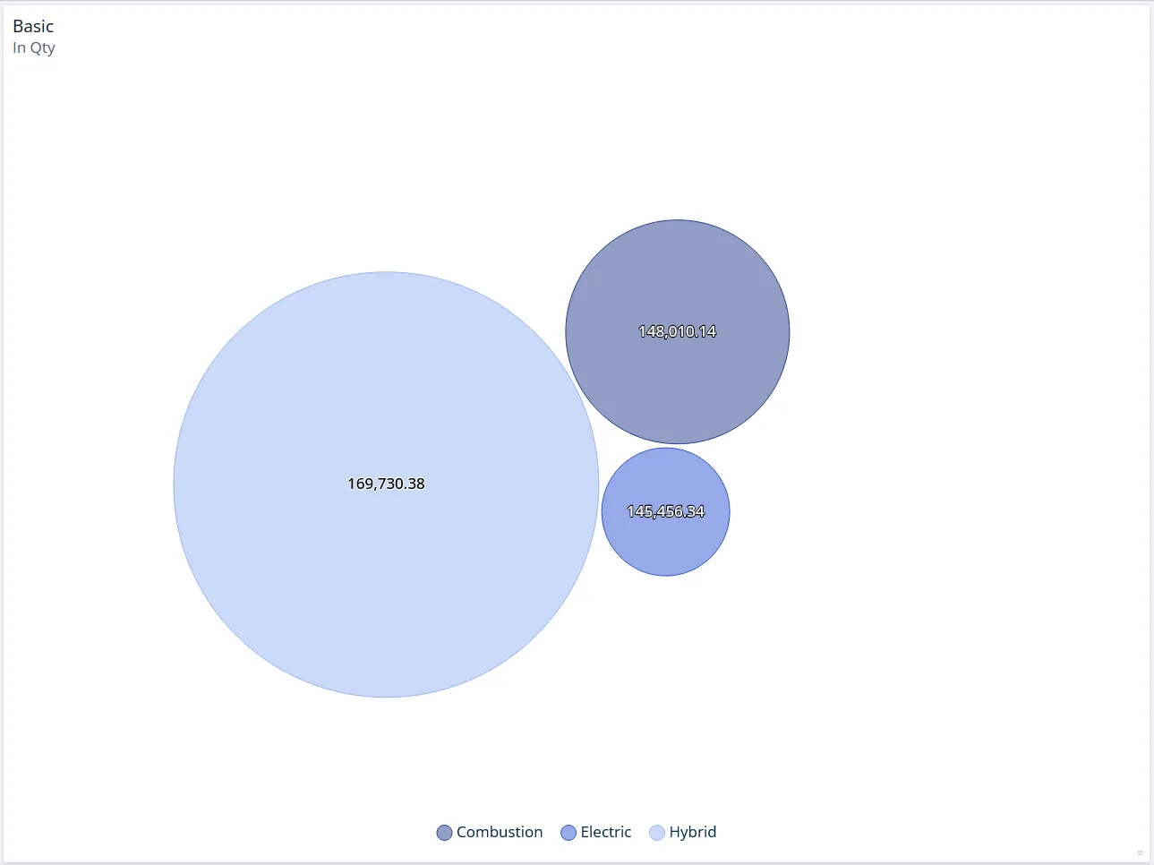 |
| KPI | One number is the point. A KPI chart shows a single figure with its unit and, optionally, a reference value such as the previous year. | 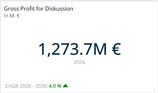 |
| Perspective Selector | You want saved filter combinations, optionally with a picture each, that switch the view of the whole worksheet. It only appears if perspectives are enabled for your instance. | 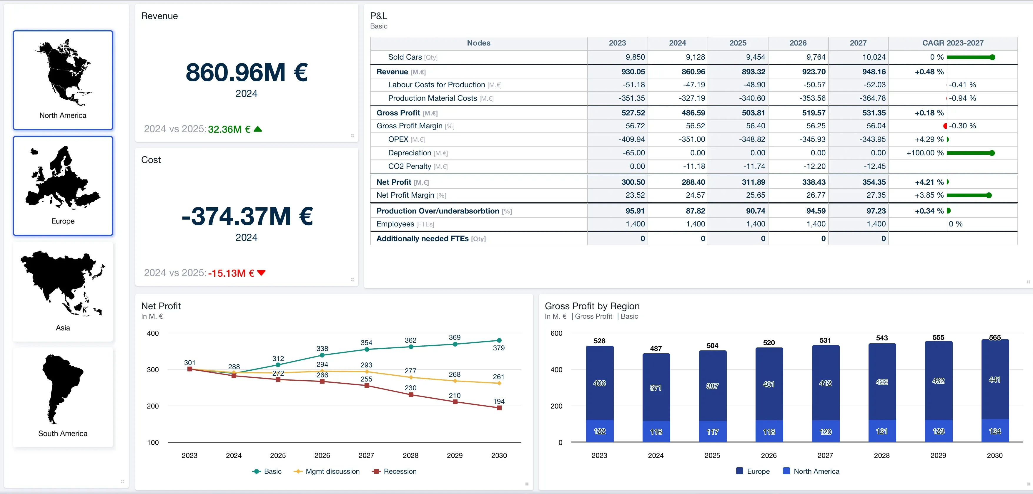 |
Template
Below the groups above sits one more option, From Template. It is not a chart type but a shortcut: it builds a new chart from a configuration you saved earlier, so a layout you use often does not have to be rebuilt. See Chart Templates.
Choosing between similar charts
Column Chart vs Bar Chart
- Use a column chart by default, especially when the x axis is time.
- Use a bar chart when category names are long, or when there are many categories, because horizontal labels stay readable.
Stacking vs Mixed Chart
- Switch on Stacked when every data series should look the same and all of them belong to the total.
- Use a mixed chart when at least one data series has to look different, for example a target or a benchmark that should not disappear into the stack.
Scenario Bridge vs Time Bridge
- Use a scenario bridge to explain why one scenario differs from another, within one time period.
- Use a time bridge to explain why one period differs from another, within one scenario.
Slider vs Split Slider
- Use a slider to change one line-item by an absolute amount. The total moves with it.
- Use a split slider to shift shares between the parts of a total while the total stays fixed.
Table vs Table (all dimensions)
- Use Table for an aggregated view, then put the dimensions you actually want on the axes.
- Use Table (all dimensions) to see every dimension of the node instead of an aggregate.
Table vs Input Table
- Use a table to display results. It is read-only, and sits under Tables when you add a chart.
- Use an input table when readers should type values into the worksheet. It sits under Simulations instead, because entering values runs a simulation.
Related
- Creating Charts: how to add a chart, duplicate one, and reuse a configuration as a chart template.
- Data Display in Charts and Tables: sorting, colors, axes and the rest of the chart editor.
- Bridges: grouping assumption effects and adding intermediate sums in scenario and time bridges.