Model Editor UI
The Model Editor is the central screen for building and maintaining models in Valsight.
The screen is organized around one core principle: the canvas is the source of selection, and the surrounding areas update to reflect what is currently selected. The header and action bar remain stable and provide global actions and navigation, while the Function Editor and Context Panel change depending on whether a node, an annotation or nothing is selected.
It includes:
- A global header for model-wide context and actions
- A canvas where the model graph is displayed
- An action bar at the bottom for navigation, selection and creation
- A function editor for node calculations
- A right-side context panel for model, node and annotation configuration
Layout at a glance
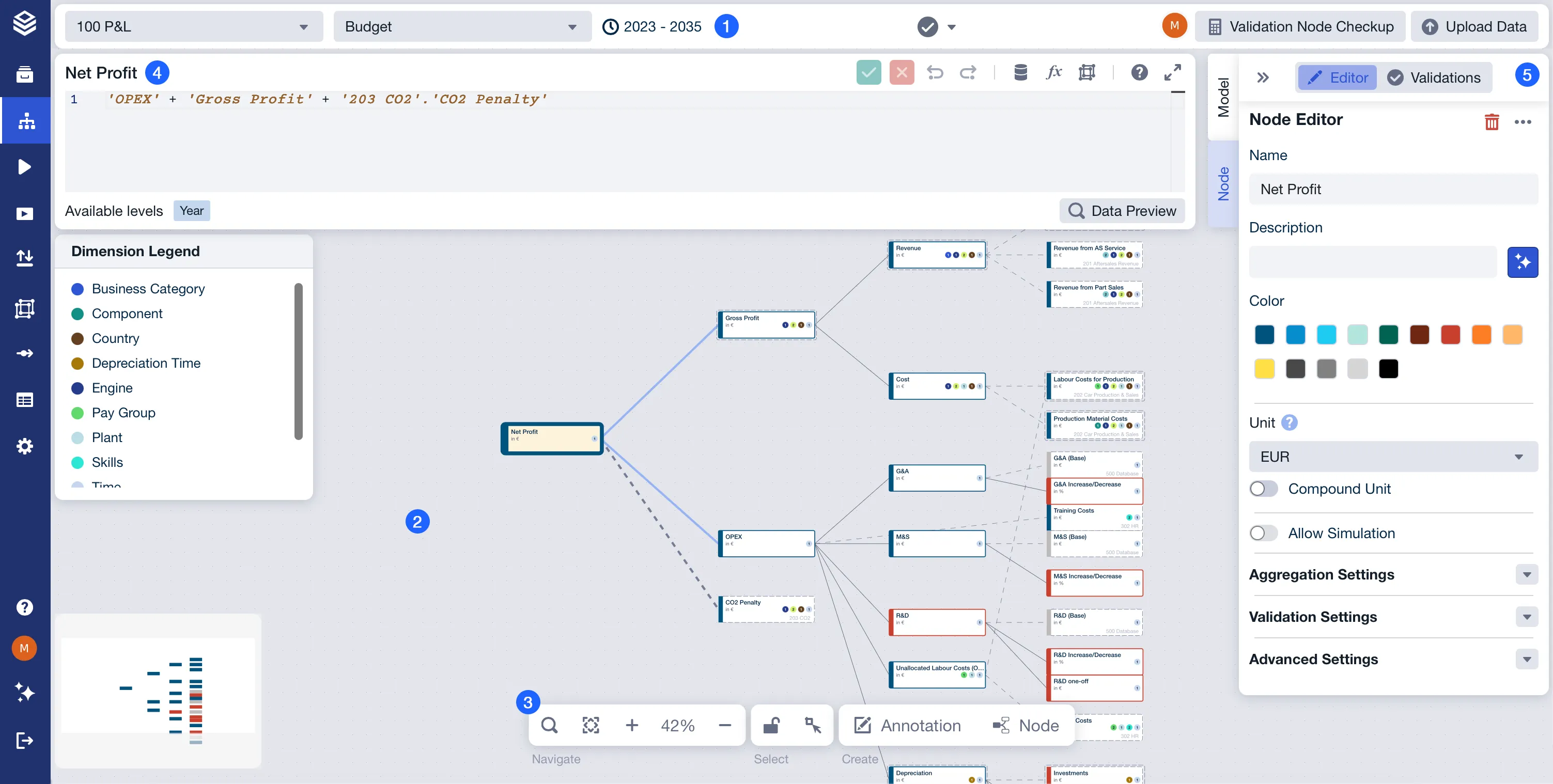
Legend
Header

The header provides global context and actions for the current model. It remains visible while you work on the canvas.
Used for
- Changing the active model context
- Providing model-wide actions and status indicators
Contains
- Model selector to switch between models
- Project horizon indicator
- Validation status and validation-related actions
- Collaboration indicators (for example, active users)
- Global actions (for example, validating the model or uploading data)
Canvas
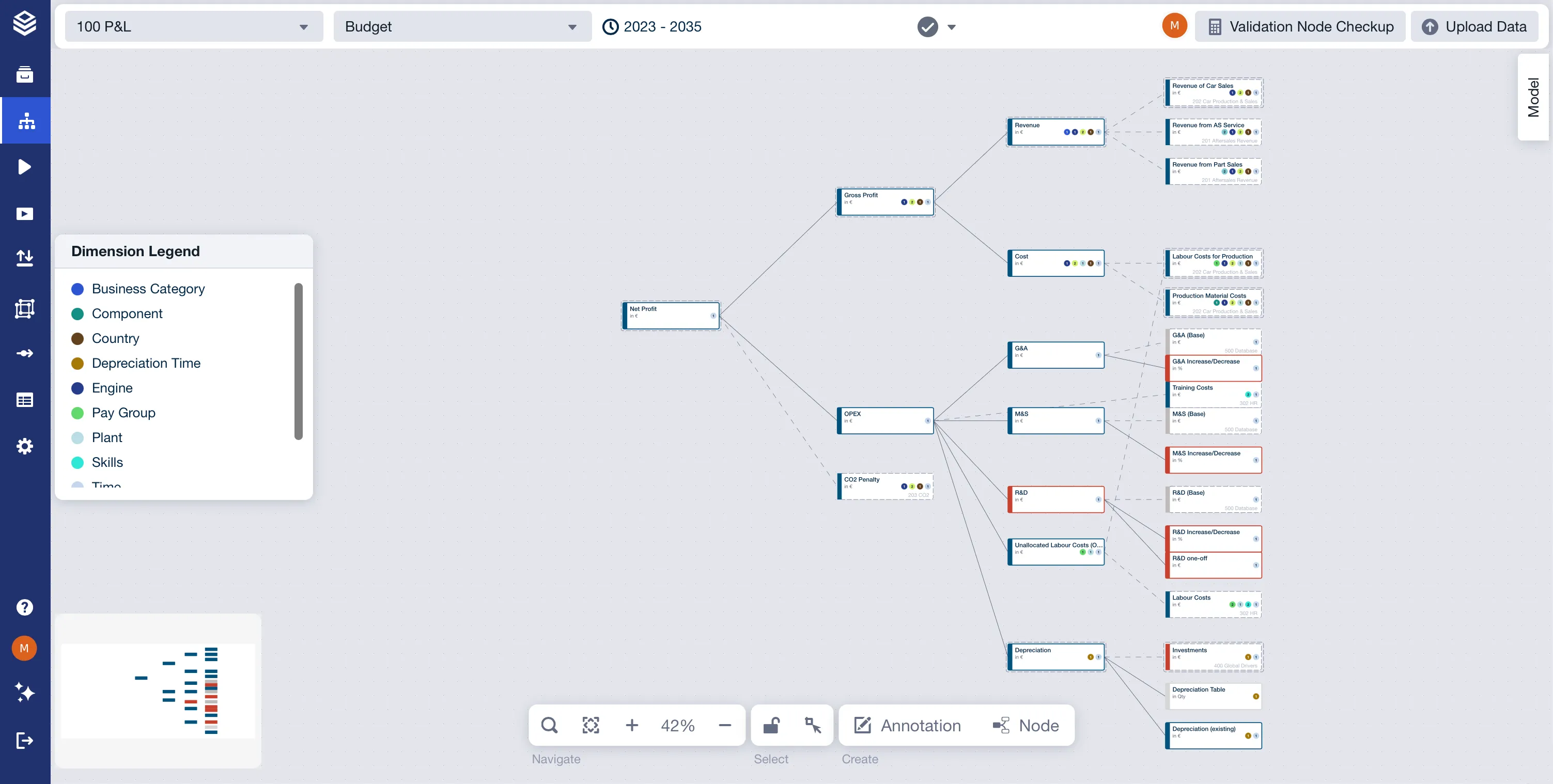
The canvas is the main area where your model is displayed as a node graph. It shows nodes, connections, and annotations.
Used for
- Visualizing and arranging model structure
- Inspecting how nodes and drivers relate to each other
Contains
- Nodes representing metrics, drivers, and calculations
- Connectors representing dependencies between nodes
- Annotations used to document structure and intent
Optional overlays
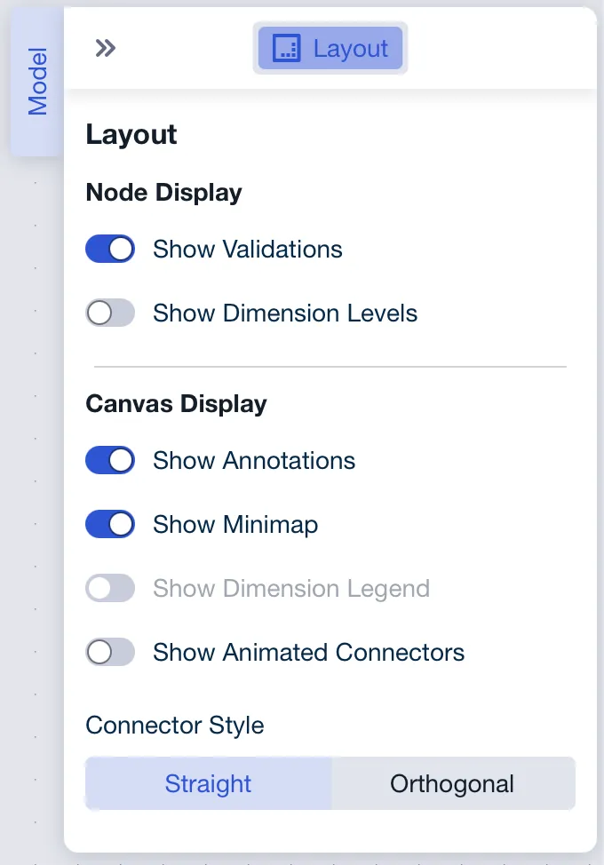
The canvas supports optional overlays that can be shown or hidden in the Model section of the Context Panel:
- Minimap: Provides a compact overview of the full model layout
- Dimension legend: Shows which dimensions are used by nodes in the current model. It is only available while Show Dimension Levels is on. With that setting off the legend toggle is greyed out, and its tooltip reads ‘Activate “Show Dimension Levels” to enable the legend.’ See Level Indicators on Nodes
Action Bar

The action bar is a persistent control strip at the bottom of the Model Editor. It provides quick access to navigation, selection and creation actions.
Used for
- Navigating the model view
- Controlling selection and layout behavior
- Creating new elements on the canvas
Contains
- Navigation controls such as search, fit-to-view, and zoom
- Selection controls such as layout lock and selection mode
- Creation controls for adding nodes or annotations
Layout lock
Layout lock freezes the position of everything on the canvas: nodes, annotations and swimlane dividers alike. Nothing can be dragged while it is on, but everything else stays available, so you can still select nodes, edit them and draw connectors. Use it to read or present a model without nudging its layout by accident.
The button carries a padlock icon, and its tooltip reports the current state as ‘Layout lock: On’ or ‘Layout lock: Off’. It starts off every time the Model Editor is opened, because the setting is not saved: locking the layout in one session does not lock it in the next. It appears only if you have the rights to edit the model.
If a node will not move, check layout lock first. It is the most common reason a model refuses to be rearranged, and nothing else on the canvas behaves differently while it is on.
Function Editor

The Function Editor is the area used to view and define the calculation logic of a selected node. It is displayed in the Model Editor below the header when a node is selected.
Used for
- Viewing and editing a node’s calculation expression
- Reviewing node-specific context relevant to the calculation
Contains
- Node name and contextual metadata
- Controls to save or discard changes
- Undo and redo controls
- Shortcut buttons for connecting data or inserting functions and levels
- Access to data preview for the selected node
- A display of available levels for the selected node
Contextual behavior
- Updates when a different node is selected
- Not shown when no node is selected or when an annotation is selected
Context Panel
Model Tab
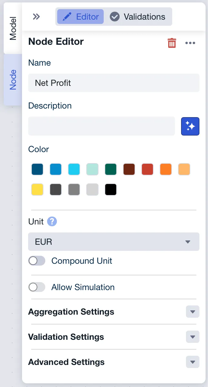
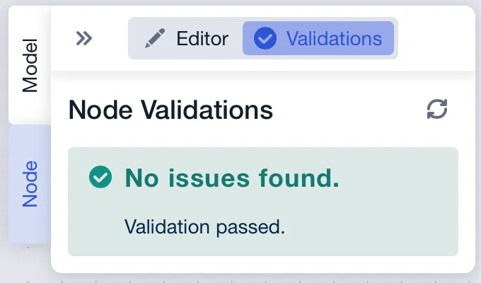
Node Tab
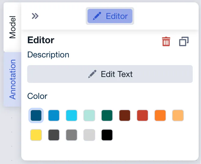
Annotation Tab
The Context Panel is the right-side configuration area of the Model Editor. It displays contextual settings and controls based on the current selection.
Used for
- Reviewing and adjusting settings related to the current context (model, node, or annotation)
- Viewing node validations
Contains
- Model mode: Model-level layout and display settings when no element is selected
- Node mode: Node configuration and a validations section when a node is selected
- Annotation mode: Annotation configuration when an annotation is selected