Stacking and Stack Totals
Columns, bars and areas sit next to each other by default. Stacking places them on top of each other instead, so the height of a bar is the total and each segment is one part of it.
What it is
Switch on the Stacked checkbox next to the chart type buttons in the chart editor. Use it when the data series all belong to the same total, for example the parts of a gross profit effect.
The checkbox is offered on column, bar, area, line and mixed charts. Tables, pie charts, packed bubble charts and waterfall charts do not have it.
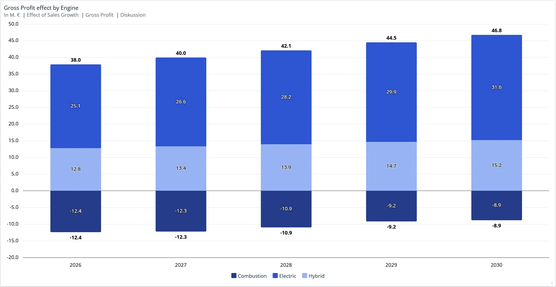
Stacking applies to a whole chart type. To stack most data series but keep one of them separate, for example a benchmark line drawn across the stack, use a mixed chart instead.
When to use it
- The data series are parts of one figure and their sum is meaningful.
- You want to show both a total and its composition without a second chart.
- Values run both above and below zero and you want the positive and negative parts read separately.
Leave stacking off when the data series are alternatives rather than parts, for example the same key figure in different scenarios. Those belong side by side.
Configuration
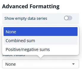
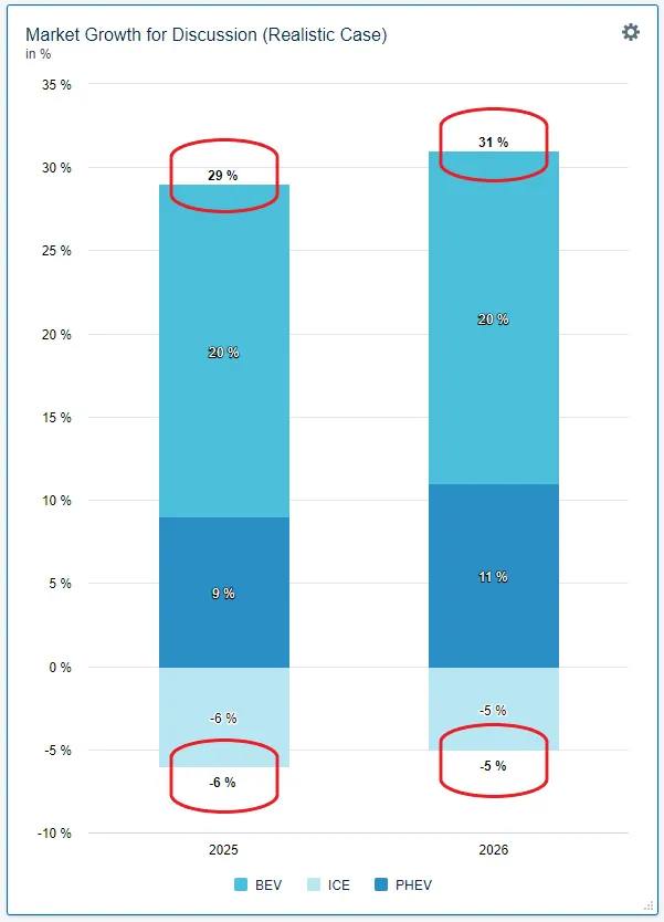
Once a chart is stacked, you can label the total of each bar. The Stack Totals drop-down in the chart editor offers three options.
| Option | What you get |
|---|---|
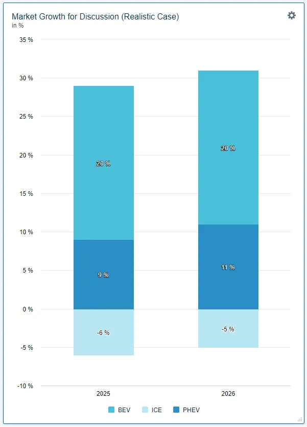
| None | The default for a new chart. Only the proportional values of the segments within a bar are shown, with no total. |
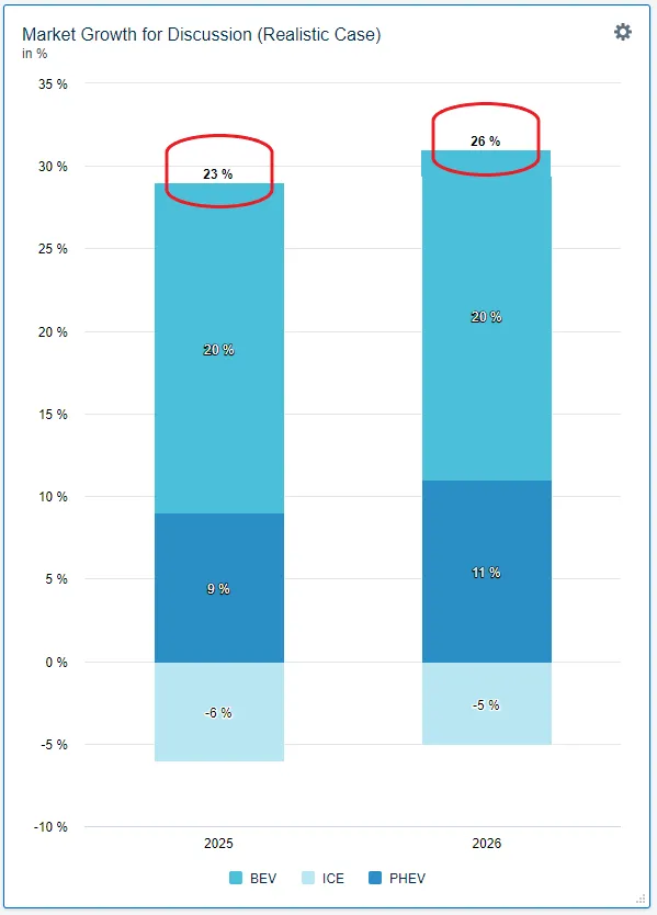
| Combined sum | The total value of the whole bar is shown on top of it. |
| Positive/negative sums | The sum of the negative values is shown at the bottom end of the bar and the sum of the positive values at the top end. |
None
Combined sum
Positive/negative sums
Good to know
- Setting several data series to bars does not stack them. Stacking is the separate Stacked checkbox, and without it the bars stand side by side.
- No Stack Totals drop-down? It only appears once Stacked is on, and never on pie or waterfall charts.
- A mixed-chart series set to Line never stacks. It runs in front of the stack whether Stacked is on or off. This exemption is specific to the Line option in a mixed chart: on a plain line chart the lines do stack when Stacked is on, and a mixed-chart series set to Spline stacks with the other splines.
- Stack Totals can rescue overlapping labels. When data labels collide, a combined sum often reads better than the individual values. See Overlapping Data Labels.
Related
- Mixed Charts: show one data series differently from the rest, so it stays out of the stack.
- Formatting Charts: sorting, colors, scales and table styles.