Scenario Bridges
A scenario bridge explains why two or more scenarios differ. It steps from one scenario’s value to the next through the individual effects that separate them, all within one time period.
What it is
Each scenario in the chart gets its own sum bar, and the steps in between account for the gap. What those steps represent is your choice: the assumptions that differ, the line-items behind them, or the levels of a dimension such as region or product.
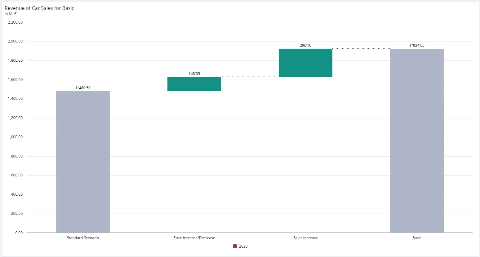
The staircase shape is what the chart editor calls a waterfall chart. A time bridge uses the same shape to explain a difference between periods rather than between scenarios.
When to use it
- You need to explain why the realistic case lands below the plan.
- You want to show which assumptions are actually driving a gap, and which are noise.
- You want that gap broken down by region or product rather than by assumption.
Use a time bridge instead when the two values you are comparing are two points in time within a single scenario.
Configuration
Create the bridge
-
Click the Chart button in the upper right corner of a worksheet.
-
Select Scenario Bridge in the chart selection.
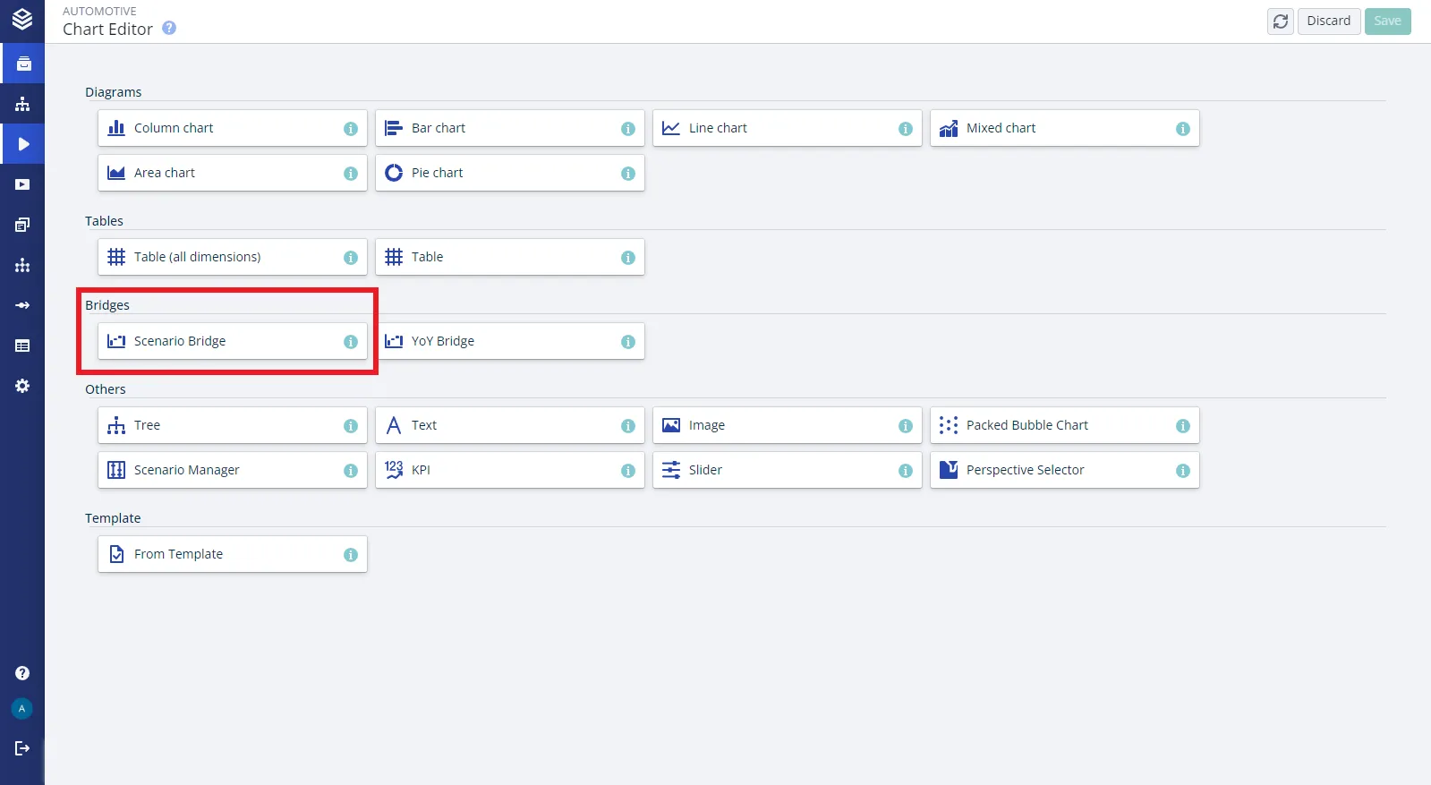
-
Select the node to visualize.
-
Select two or more scenarios to compare.
-
Select how the difference should be broken down: by assumptions, by line-items or by a dimension.
-
Select the time period to show.
Change it afterwards
| Setting | What it does |
|---|---|
| Node | The node whose data the bridge shows. Change it in the chart editor at any time. |
| Scenarios | Which scenarios appear. Each one you add gets its own sum bar. |
| Configure Axes | Puts line-items, dimensions or assumptions on the axis. An assumption bridge starts with Years as the data series and Assumptions on the x-axis. A bridge broken down by a dimension starts with Scenarios as the data series instead. |
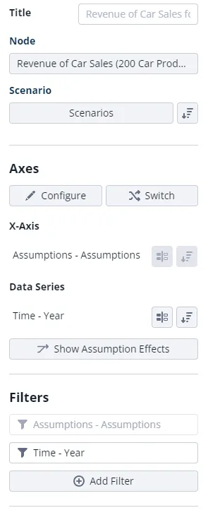
Break the difference down by dimension
Instead of assumptions or line-items, the steps can be the levels of a dimension, so the gap is explained by region, product or any other dimension in the model.
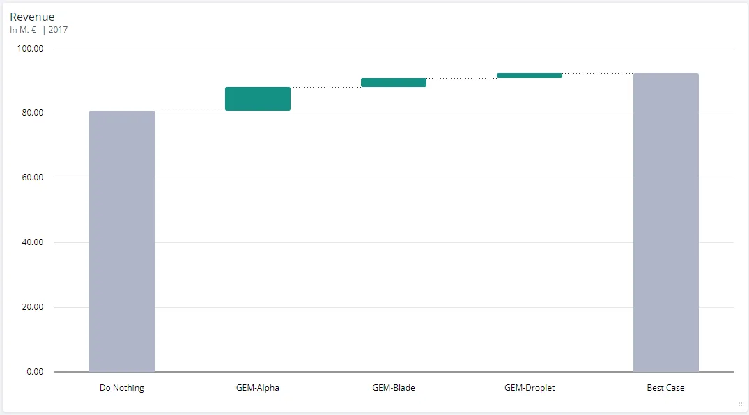
There are two ways in, depending on whether the chart exists yet:
-
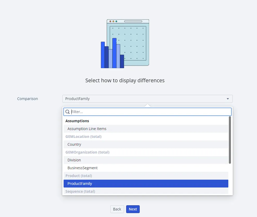
While creating the chart, select the dimension as a delta in the configuration wizard.
-
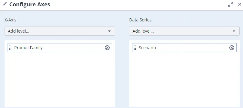
On an existing chart, choose the dimension in the axis configuration.
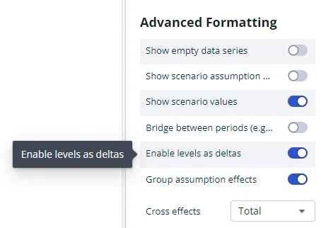
Either way, Enable levels as deltas has to be switched on for the levels to be drawn as steps.
Show line-item variants
To break the difference down by line-item variant, select Assumption line-items when configuring the chart data. Each step is then labeled with both the line-item name and the variant name.
Good to know
- Every scenario you add is another sum bar. A bridge across four scenarios is four sum bars with effects between each pair, which gets wide quickly. Two or three read best.
- Dimension steps need Enable levels as deltas. Without it the levels are drawn as ordinary values rather than as steps, which is the usual reason a dimension bridge looks wrong.
- The steps do not have to be effects at all. Put nodes on the axis instead and you get a plain build-up, for example revenue and costs stepping down to gross profit.
- A long bridge can be shortened by grouping. Combining the line-items of one assumption into a single bar often makes the chart readable again. See Grouping Assumption Effects.
- Assumptions can explain themselves on hover. Give an assumption a description and switch on the tooltip setting. See Showing assumption descriptions.
Related
- Time Bridges: the same staircase, explaining a difference between periods.
- Assumption Effects: how each effect is calculated, and how to show descriptions on hover.
- Grouping Assumption Effects: combine the line-items of one assumption into a single bar.
- Bridges: both bridge types and the settings they share.