Creating Charts
Add a chart to a worksheet and point it at the data you want. How to make it read well afterwards is covered in Formatting Charts.
Start here if you want to:
How charts work
Charts are the key mechanism in Valsight to display and interact with your data. They are always part of a simulation workspace, so what they display is based on a model and on the scenarios configured in that workspace. Charts can be arranged across multiple tabs, with several per tab in a dashboard-like layout.
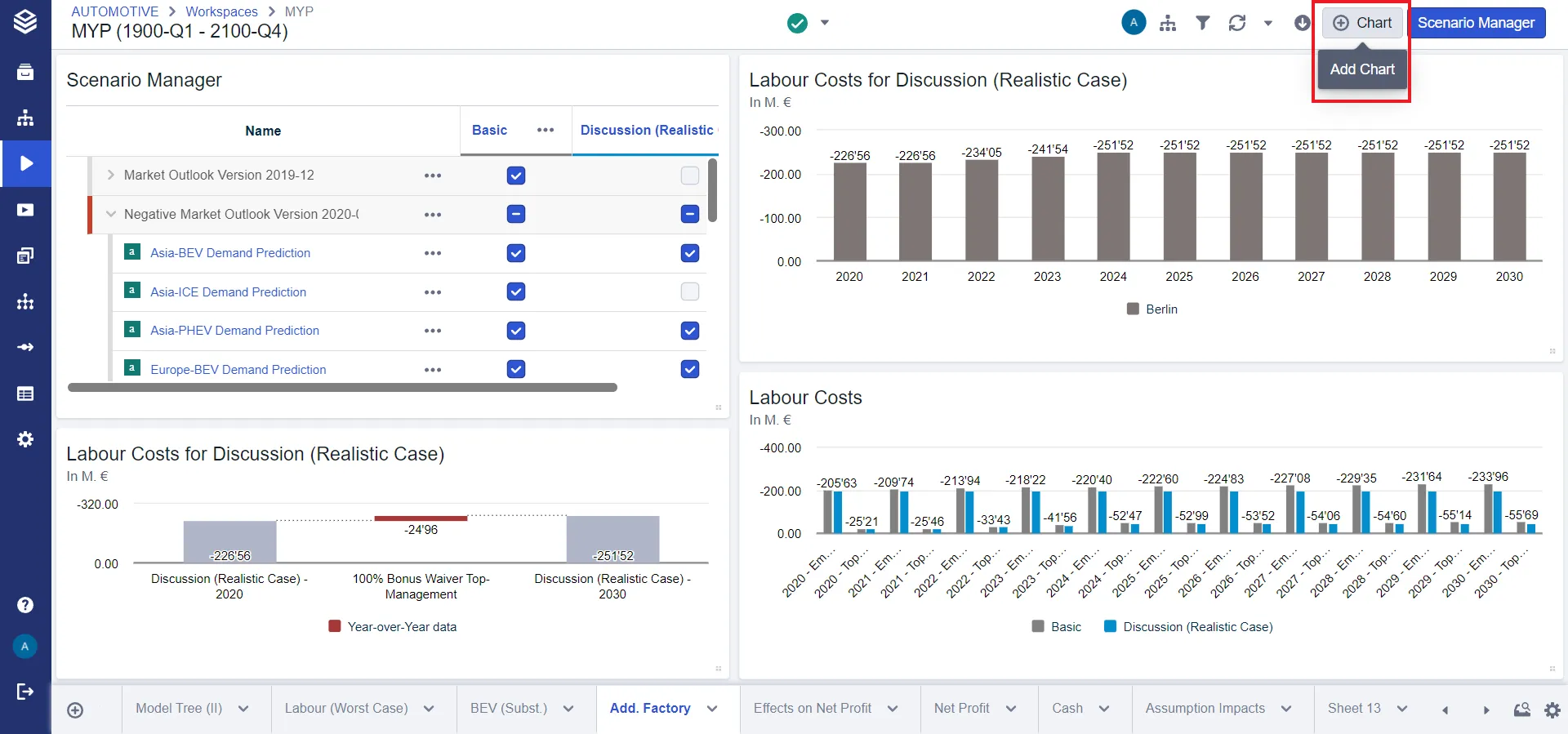
Three things are worth knowing before you build one:
- Charts are calculated, not stored. Every chart is derived on the fly from the underlying value driver logic and the configured scenarios. Changing a scenario, the model or the data recalculates it, so a chart always shows the latest figures.
- Axes and filters describe the data. You say what a chart should display by setting its axes and, optionally, its filters. The axes depend on the chart type and define the two dimensions used to visualize the data, for example which information sits on the x-axis and which property groups the data series. Filters narrow that further, to a subset.
- Three dimensions are special. Scenarios, years and nodes should never be aggregated in a chart. Each has to be either placed on an axis or configured as a filter.
Adding a chart
- Either add a tab with the plus button at the far left of the tab bar, or add a chart to an existing tab with the Chart button in the header.
- Select a chart type. See Chart Types for which one fits your data.
- Select a scenario.
- Select a node.
To start from a configuration you already built rather than from scratch, see Chart Templates.
What you can set on a chart
Select a chart and the chart editor opens in the panel on the right. If it is already open, selecting a chart shows that chart’s properties; otherwise select the chart and click the pencil icon.
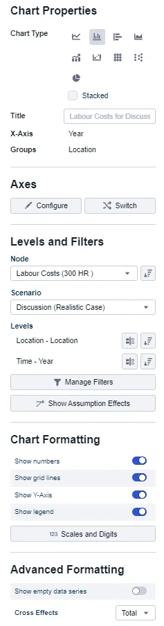
| Setting | What it does |
|---|---|
| Chart type | The data display property switches the chart type. Left to right: line, column, bar, area, mixed, waterfall, table, bubble, pie. See Chart Types for which to pick. |
| Title | Left empty, a title is proposed from the displayed nodes, years and scenarios. It can be overridden with a custom name. |
| Axis settings | Define the dimensions the chart shows, for example which dimension sits on the x-axis and which one groups the data series. Any dimension in the system can be selected, though some combinations hold no data and will display nothing. |
| Levels and filters | Restrict the chart to a subset of data. Every dimension used as an axis automatically gets a multi-select filter containing all values, except on a KPI chart, which starts with two level values selected instead. Add more with Add Filter, choosing a dimension and a level. |
| Comparison | Compare any single data point against another, as a delta or a percentage. See Delta Comparisons. |
For how to choose what the axes actually show, including aggregation and combining nodes of different dimensionality, see Data Display in Charts and Tables.
Copying a chart
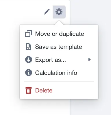
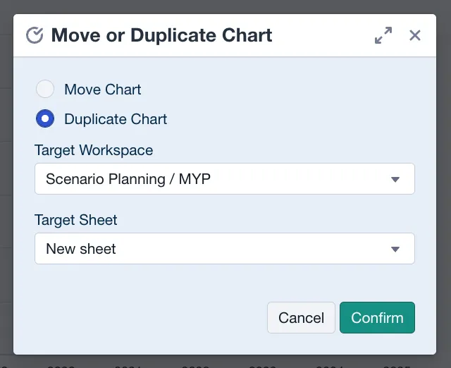
Charts can be copied from the settings button at the top right of a chart. Select Move or duplicate to place a copy on a new or a different sheet in the selected workspace.
Data format
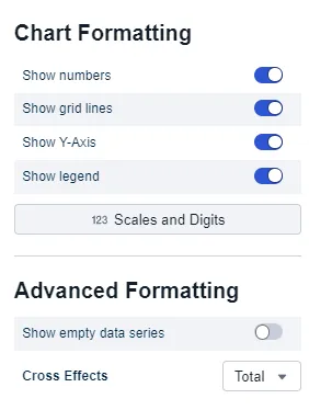
You can display numbers inside the chart, override axis settings, and configure whether a legend is shown and whether null values are hidden.
Related
- Chart Types: which chart or tile fits your data.
- Data Display in Charts and Tables: what a chart shows, and at which level of aggregation.
- Chart Templates: reuse a configuration instead of rebuilding it.
- Formatting Charts: stacking and stack totals, styling data series, columns and rows, scales and axes, table styles, and responsive text sizes.