Data Display in Charts and Tables
Valsight works natively with high-dimensional data. A single data point of a Sales node can represent one combination of country, month, product and channel (more on dimensionality). A chart shows two dimensions at a time, so every chart involves a decision about what to do with the rest.
Aggregation is the decision
A node holds more dimensions than a chart can display. The axes you set decide two things at once: which dimensions the reader sees, and what happens to the dimensions left over. Anything not placed on an axis or restricted by a filter is aggregated away.
How it is aggregated, by sum, average or otherwise, is not a chart setting. It follows the Aggregation Settings configured on the node in the model editor.
The dimensions scenarios, years and nodes are special: they should never be aggregated. Each has to sit on an axis or be pinned by a filter.
This works the same way for charts, tables, and scenario and time bridges.
Setting the axes
- Create a chart or table.
- Click the Configure Axes button.
- Place the dimension levels you want on rows and columns. Drag a level to move it between the two.
- Confirm.
Dimension levels that are grayed out are not present in the node you are charting. Scenarios and assumptions are added in the same way as ordinary dimensions.
A worked example
Take monthly clothing store sales in quantity for 2017 to 2019. Besides the time dimension, which runs Year to Quarter to Month, the data carries three dimensions:
| Dimension | Level | Level values |
|---|---|---|
| FLocation | FCountry | CH, DE, AT, Other |
| FProduct | FProduct-Group | Clothes, Accessories |
| FProduct | FProduct | T-Shirt, Pants, Sunglasses |
| FChannel | FChannel | Offline, Online |
To see aggregate results for the business as a whole, put country, product group and quarter on the axes and leave channel off. Channel is then aggregated away, and the chart shows quarterly figures per country and product group.
Totals
There are three ways to add a total, and the difference between them is how they treat filtered-out data.
| Total | Where | What it aggregates |
|---|---|---|
| Grand totals | Configure menu | The visible data |
| Subtotals | Configure menu | The visible data |
| Show values of higher level | Checkbox below the totals options | All data belonging to the higher level, including filtered-out values |
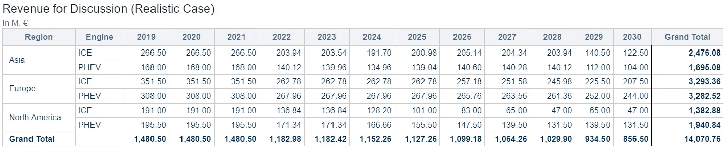
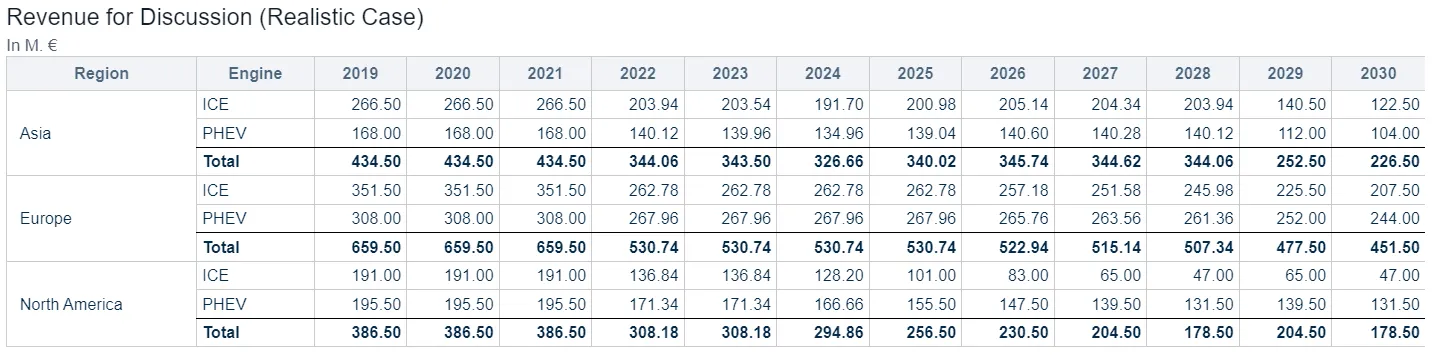
Totals over visible data
Grand totals and subtotals aggregate what the reader can see. Filter a value out and the total drops accordingly.
The original table:

With subtotals activated per column:

With Grand SUV X and Fancy Sedan 1 filtered out, the subtotals now aggregate only the rows still shown:

Totals over all data
Including a higher level of a dimension gives you the total of that level regardless of the filters, because it aggregates everything belonging to it. Adding quarters to a monthly chart is the usual case: you can filter down to a few months and still read the full quarter total beside them.
Here Show values of higher level is switched on. It is available because Model and Vehicle Class are levels of the same dimension:

The SUV and Sedan totals now cover the visible and the filtered-out rows together, which is what you want when comparing a single level value against the total of its level.
Note:
Subtotals and the unfiltered value of the higher level cannot be shown at the same time.
Combining nodes of different dimensionality
A single chart or table can show several nodes, even when they do not share the same dimensions.
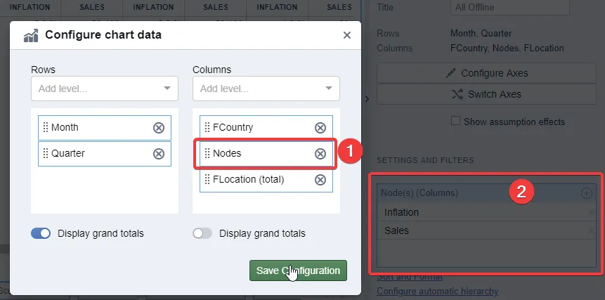
- In the Configure Axes dialog, add the nodes option to an axis.
- Add the nodes you want through the tile settings.
- For any dimension that is not present in all of the selected nodes, also include that dimension’s (total) level.
Step 3 is what makes the mismatch work. Without it, a node that lacks the dimension has nothing to display against it.
Configuration:
Result:
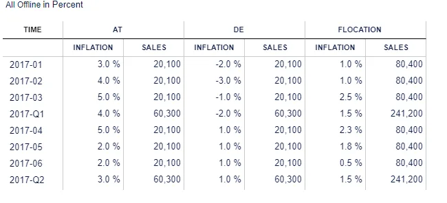
To show sales at product level while keeping the inflation numbers, which have no product dimension, include both FProduct (Total) and FProduct in the table.
Good to know
- Aggregation is set on the node, not the chart. Whether a dimension sums or averages comes from the node’s Aggregation Settings. Changing the axes changes what is aggregated, never how.
- A grayed-out level means the node does not have it. It is not a permissions problem.
- Subtotals and higher-level values answer different questions. Use subtotals for “what do the rows I am looking at add up to”, and a higher level for “what is the real total, including what I filtered out”.
- A node missing a dimension needs that dimension’s (total) level. Otherwise it drops out of the chart when the dimension goes on an axis.
- A table with nodes in rows unlocks extra options. It carries additional formatting settings and can build an automatic hierarchy. See Styling Data Series, Columns and Rows.
- Assumptions on an axis add two checkboxes. Putting assumptions on rows or columns offers creating YoY bridges and showing assumption details. See Time Bridges.
Related
- Creating Charts: adding a chart and pointing it at your data.
- Formatting Charts: sorting, scales, colors and table styles, once the data is right.
- Aggregation Settings: how a node aggregates, set in the model editor.
- Table Formatting: table style, column widths and merged header cells.