Styling Data Series, Columns and Rows
Everything a chart or table is built from can be styled on its own: its color, the look of its value labels, whether a row reads as a subtotal, and whether it appears at all.
What it is
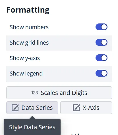
The chart editor puts these settings in one dialog, opened from the Formatting section. The two buttons there, and the title of the dialog, are named after whatever the chart is built from, so they change with the chart type:
| Chart | Buttons you get |
|---|---|
| Table | Columns and Rows |
| Column chart with Stacked off | Groups and X-Axis |
| Column chart with Stacked on | Stacks and X-Axis |
| Line, area, bar and the rest | Data Series and X-Axis |
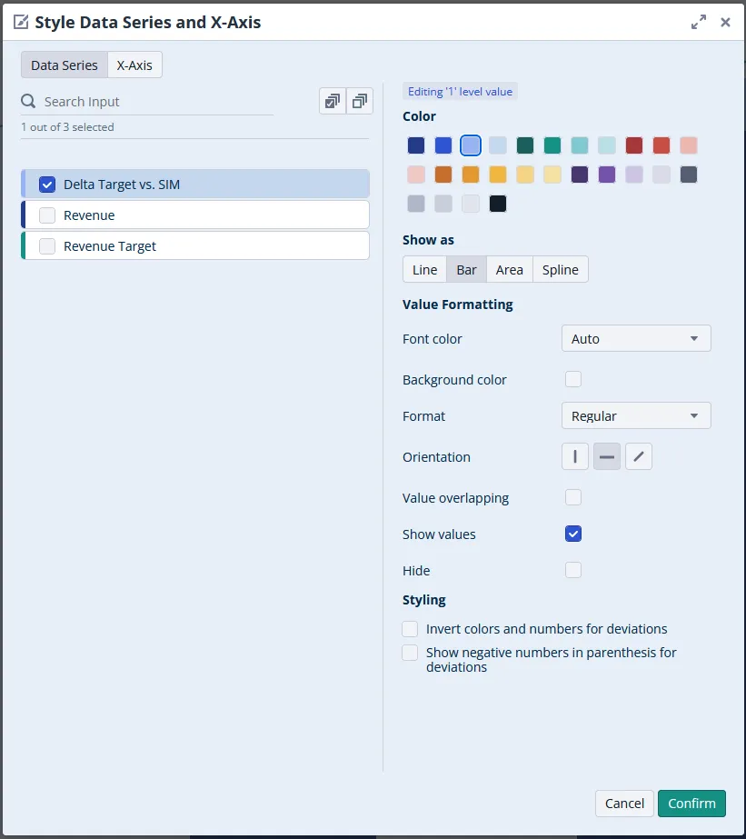
Whichever pair you get, both work the same way: a list on the left, and the properties of whatever you tick on the right. Styling is per entry, not per chart, so ticking two entries and changing a property applies it to both. That is how you color a whole group consistently without repeating yourself.
When to use it
- You want a scenario, product or region to keep the same color across every chart on a sheet.
- You want to highlight one data series and mute the others.
- Value labels are colliding and you want to hide some of them.
- You are building a profit and loss or cash flow statement and need subtotal and total rows to stand out.
Configuration
- Select the chart or table. The chart editor opens on the right.
- Scroll to the Formatting section and click either of the two buttons named in the table above.
- Tick one or more entries in the list on the left. Changes apply to everything ticked.
- Set the properties described below, then click Confirm.
Data series and columns
| Property | What it does |
|---|---|
| Color | Sets the color of the data series itself, for example its line or its bars. |
| Show as | Switches the data series between Line, Bar, Area and Spline. Mixed charts only, and only on the data series side, never on the x-axis. See Mixed Charts. |
| Font color | Sets the color of the text shown on the data series. |
| Background color | Sets a background color behind that text. |
| Format | Applies Bold, Italic, underline, or regular, which is the default. |
| Orientation | Rotates the value labels: vertical, horizontal or diagonal. |
| Value overlapping | Allows the value labels of this data series to overlap instead of being dropped when space runs out. |
| Show values | Shows the value labels on the data series. Clear it to hide them. |
| Hide | Hides the whole data series from the chart, not only its labels. |
Rows
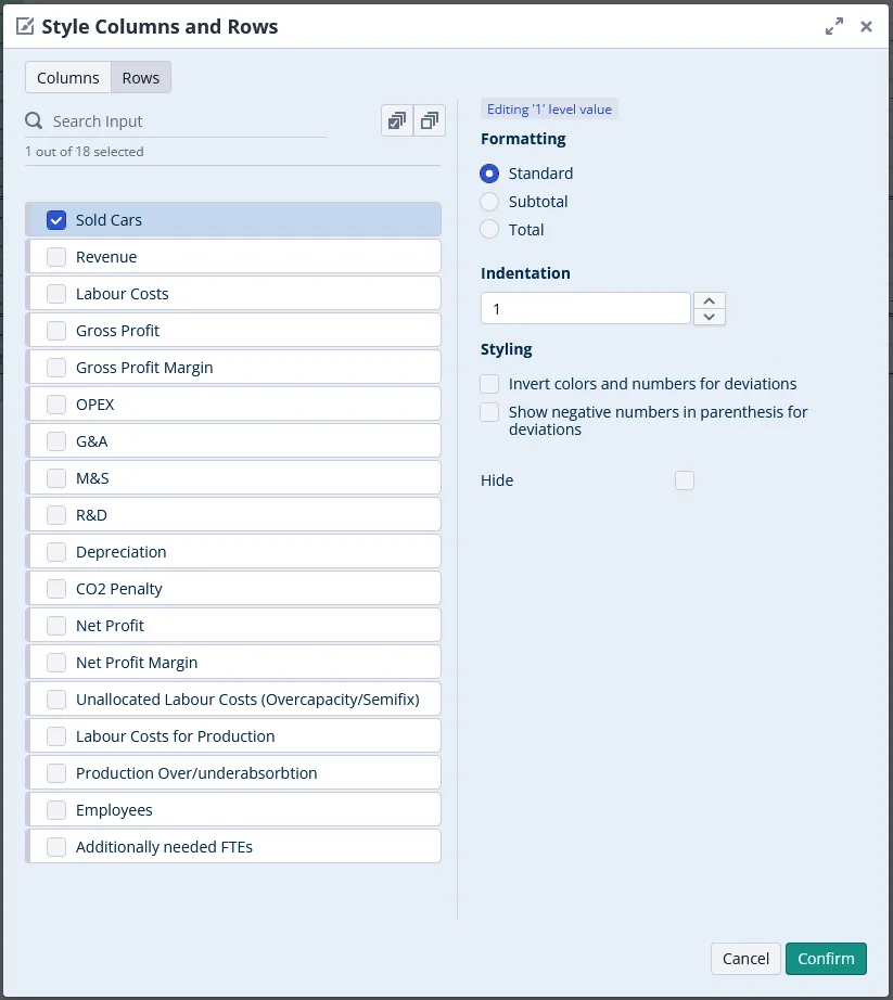
Rows carry formats rather than colors, which is what makes a financial statement read like one.
| Property | What it does |
|---|---|
| Standard | The row as normal text. This is the default. |
| Subtotal | Bold, with a horizontal line above it. |
| Total | Bold, with horizontal lines above and below it. |
| Indentation | Moves the row to the right. Several steps deep are possible. |
| Hide | Leaves the row out of the table. |
Deviations
Both tabs carry a Styling group that only affects delta and comparison columns.
| Property | What it does |
|---|---|
| Invert colors and numbers for deviations | Swaps the up and down color and the sign, so a cost saving can read as green rather than as a negative. |
| Show negative numbers in parenthesis for deviations | Wraps a negative delta in parentheses instead of giving it a minus sign. |
Comparisons
A fourth group, Comparisons, appears when every entry you have ticked is a comparison.
| Property | What it does |
|---|---|
| Hide comparison bars in tables | Suppresses the in-cell bars a comparison column draws behind its numbers. |
Good to know
- Some selections offer nothing to format. A value with an active delta setting cannot be formatted, and the dialog says so instead of showing properties. Assumptions, assumption line-items and assumption properties can be neither sorted nor formatted, so selecting one leaves the dialog empty. Neither is a fault.
- Colors are per data series, not per node. To set a color once for a whole model, see Editing the Color Palette.
- Hiding a value is not the same as hiding a data series. Show values controls the label, Hide removes the line or bar.
- Hiding a data series affects exports. A series hidden through the Hide checkbox is excluded from a Formatted XLSX export but still present in a Raw XLSX or OData export.
- Show values needs numbers switched on for the whole chart. If Show numbers is off in the Formatting section, the per-entry Show values option is disabled.
- Formats are per row, not per level. Marking one row as a total does not mark its siblings.
- Order is set elsewhere. This dialog styles entries but does not reorder them: see Sorting Level Values.
- In a mixed chart, styling and chart type live in the same place. The Show as option that turns a data series into a line, bar, area or spline sits alongside these properties. See Mixed Charts.
Related
- Mixed Charts: choose a different shape per data series.
- Sorting Level Values: the order the entries appear in.
- Table Formatting: table style, column widths and merged header cells.