KPI Charts
A KPI chart displays one key figure as a single large number with its unit, so the figure that matters is readable at a glance rather than being read off an axis.
What it is
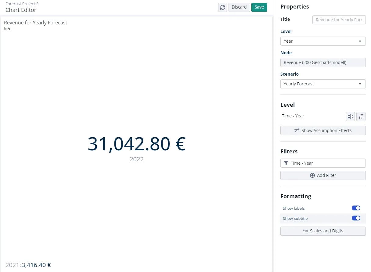
A new KPI chart uses the first two years of your project horizon as its values, and Year as its level. Any other level of your dimensionality can be chosen instead, under Level in the chart editor.
Of the two level values, the primary one is displayed large in the middle of the chart and the secondary one small in the lower left. That arrangement is the point: the primary value is the KPI, and the secondary one is context for it. The default order emphasizes the most recent year.

When to use it
- One number is the message, for example this year’s gross profit or a CO2 total.
- You want that number readable from across a room when presenting.
- You want a year-over-year reference beside it without drawing a whole chart.
Use a table when several figures matter at once, or a line chart when the shape of the development matters more than the latest value. See Chart Types.
Configuration
| Setting | Where it is | What it does |
|---|---|---|
| Level | Level section of the chart editor | Chooses which level the two values come from. Year by default. |
| Sort | Sort dialog, Level section | Decides which value is primary and which is secondary. |
| Filters | Filters section | Selects which level values are shown. |
| Comparison | Chart editor | Adds the delta between the two selected level values. |
A comparison appears in the bottom left corner by default, showing a positive delta in green and a negative one in red.
Good to know
- Exactly two level values, no more. Selecting a third produces an error saying the chart type does not support more than two values. Delete the comparison or narrow the selection in Filters.
- A comparison needs exactly one other value. With more than one other value selected, the comparison cannot be displayed as a secondary value.
- The large number is the primary value, not the newest one. If the wrong figure is large, change the order in the Sort dialog rather than the filter.
Related
- Chart Types: the other chart types and tiles.
- Delta Comparisons: how the comparison methods, including CAGR, are calculated.